
Easy & Efficient NOTIFICATIONS IN AN Emergency
Redesigned & shipped mass messaging enterprise application
PRODUCT – Regroup provides a single platform for its clients to send messages (emergency or otherwise) to thousands of people across multiple mediums (call, text, social media, P.A., digital signage, etc.).
CHALLENGE – The enterprise application was visually outdated and non-responsive and the application's content and navigation needed more organization. The initial scope started on the dashboard/home, send a post, and group management pages, but soon extended to encompass the whole application. Major focus areas included designing a more current and cohesive interface design, and addressing information architecture and content organization to increase usability.
REDESIGN – Though multiple iterations of hand-drawn and digital designs, the navigation structure was modified and content was organized and chunked to increase understanding and ease of use. Templates and message results were brought to the forefront based on business and customer needs.
ROLE – I was the UX designer and researcher on cross-functional team (leadership, engineering, product managers, customer service). Collaborated on the handoff of the wireframes with Eido Gat, who created the final visual design mockups.


"Holly led the User Experience revamp of the Regroup Mass Notification platform, which serves the messaging needs of many large enterprise clients. The platform's existing UX/UI was initially completed in 2008, and edited along the way, but we wanted to work with Holly to give us something modern, clean, efficient, and engaging. She is excellent: she takes the time to listen, understand user stories, iterate, and truly lead many stake holders (product, sales, customer service, etc) to refine what's necessary. Holly's care and dedication are unsurpassed. I recommend Holly highly, and absolutely love the new UX and UI that we now have!"
–Joe DiPasquale, CEO & Founder, Regroup


Design Collaboration with a Distributed Team
Building a relationship with stakeholders in a design studio
As an external designer, I wanted to ensure the internal team had their voices heard regarding the redesign (they are the expert in their roles, after all). In order to gather insights and ideas from the team, as well as give a sense of ownership and contribution on the new design, I decided to conduct a Design Studio. The focus for the activity was the dashboard/home page of the Regroup customer-facing site.
The design studio participants included the CEO, customer service, product management, and engineering.
Design discussions on drawn sketches to further iterate at the lowest fidelity
Sketches are quick and cheap. With key stakeholders, I discussed rational for design decisions and how it may affect the customer's experience or expectation. These calls led to many "ah-ha moments" where a technical constraint or customer experience would surface.
An example was regarding displaying the results of the most recent post sent on the dashboard. Customers want reassurance that their message was sent successfully and to know if there were any issues. "Last Post" data became an important addition to the Dashboard to provide the user with reassurance, while also promoting the business's desire to guide users to the Reports section, where information like this is housed.

Using remote collaboration tools (Google Docs pictured above), we were able to continue the design discussions for each iteration, surfacing both customer and business need and technical constraints.
REDESIGNING THE NAVIGATIONAL LAYOUT FOR CONSISTENCY & TO IMPROVE WAY-FINDING
Six different navigation methods made the original application confusing
The six different types of navigation made the original application confusing to navigate and it wasn't always clear to the user what they were looking at, how they got there, or how to get back.
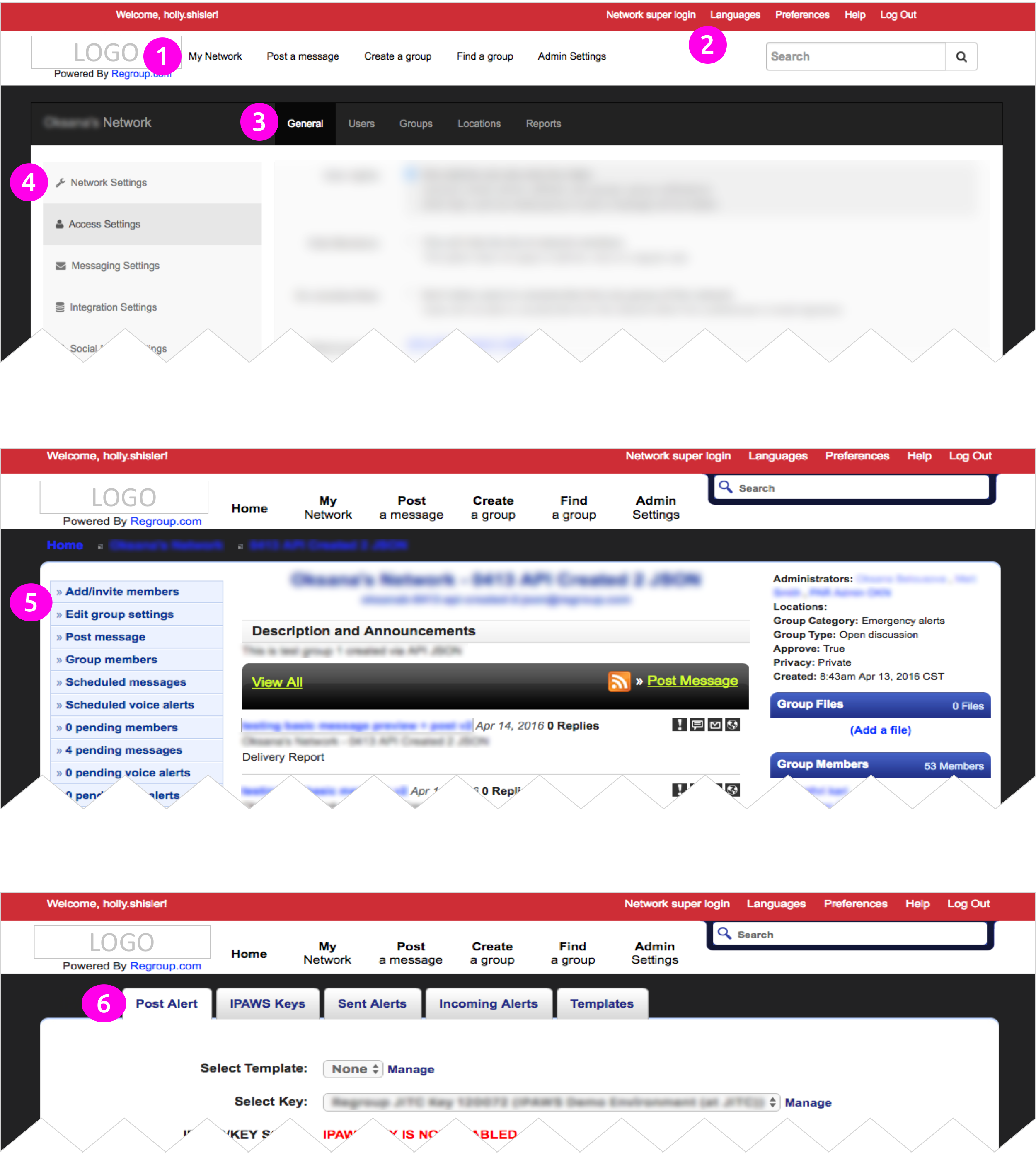
The original application was confusing due to the six navigation methods used throughout the app.
Increased user way-finding by simplifying the navigation to primary and secondary
The first challenge was to design a consistent navigation structure to ensure users are not confused and help the development team by using reusable modules. When the wireframes were shown to current customers to validate the navigation redesign, feedback was that the navigation was understandable and content was easily findable.
(1) Primary navigation structure.
(1) Primary and (2) secondary navigation structure.
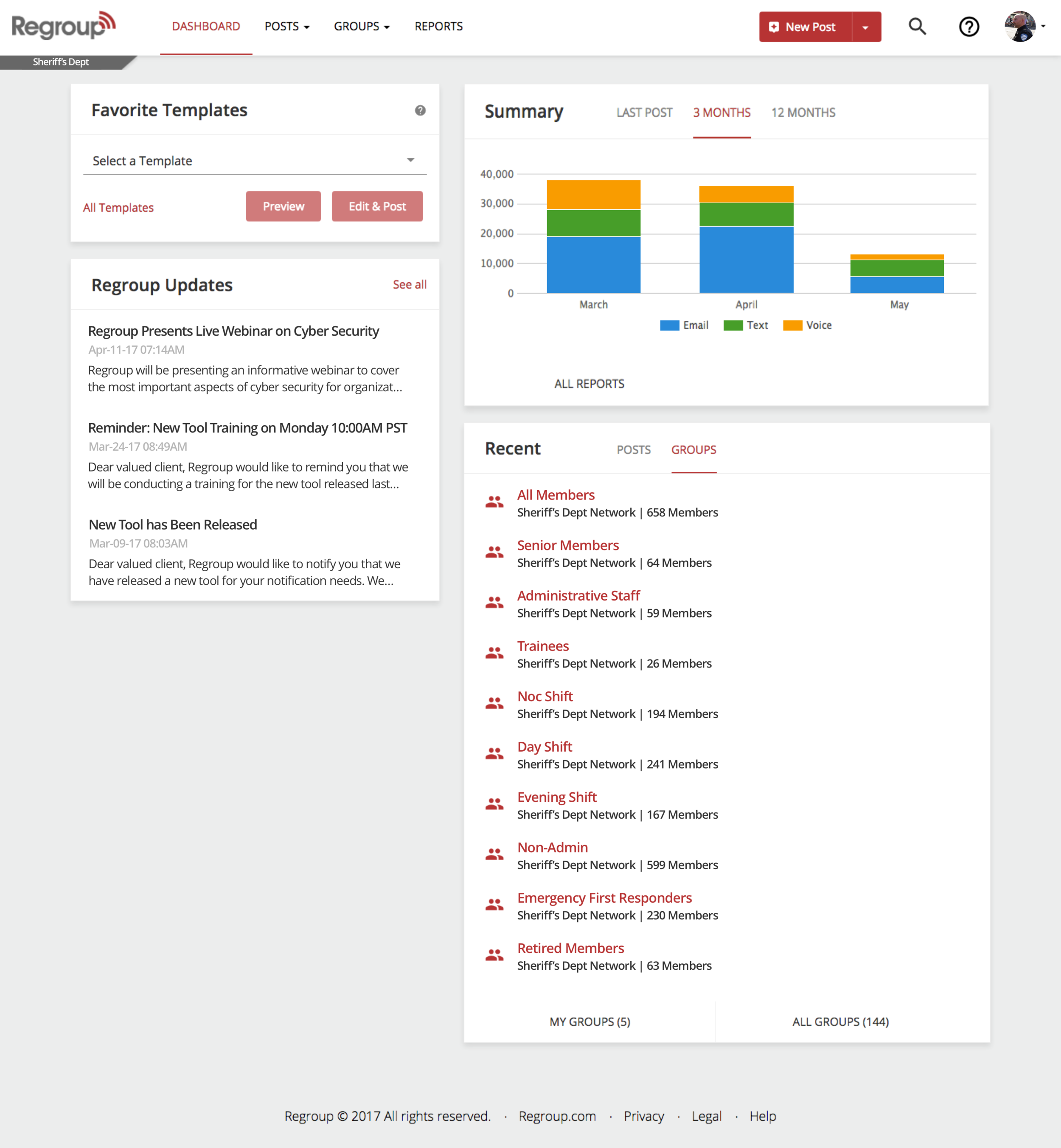
Dashboard Redesign for Quick Information & Efficient Actions
Surfacing templates for easy notifications in stressful emergency situations
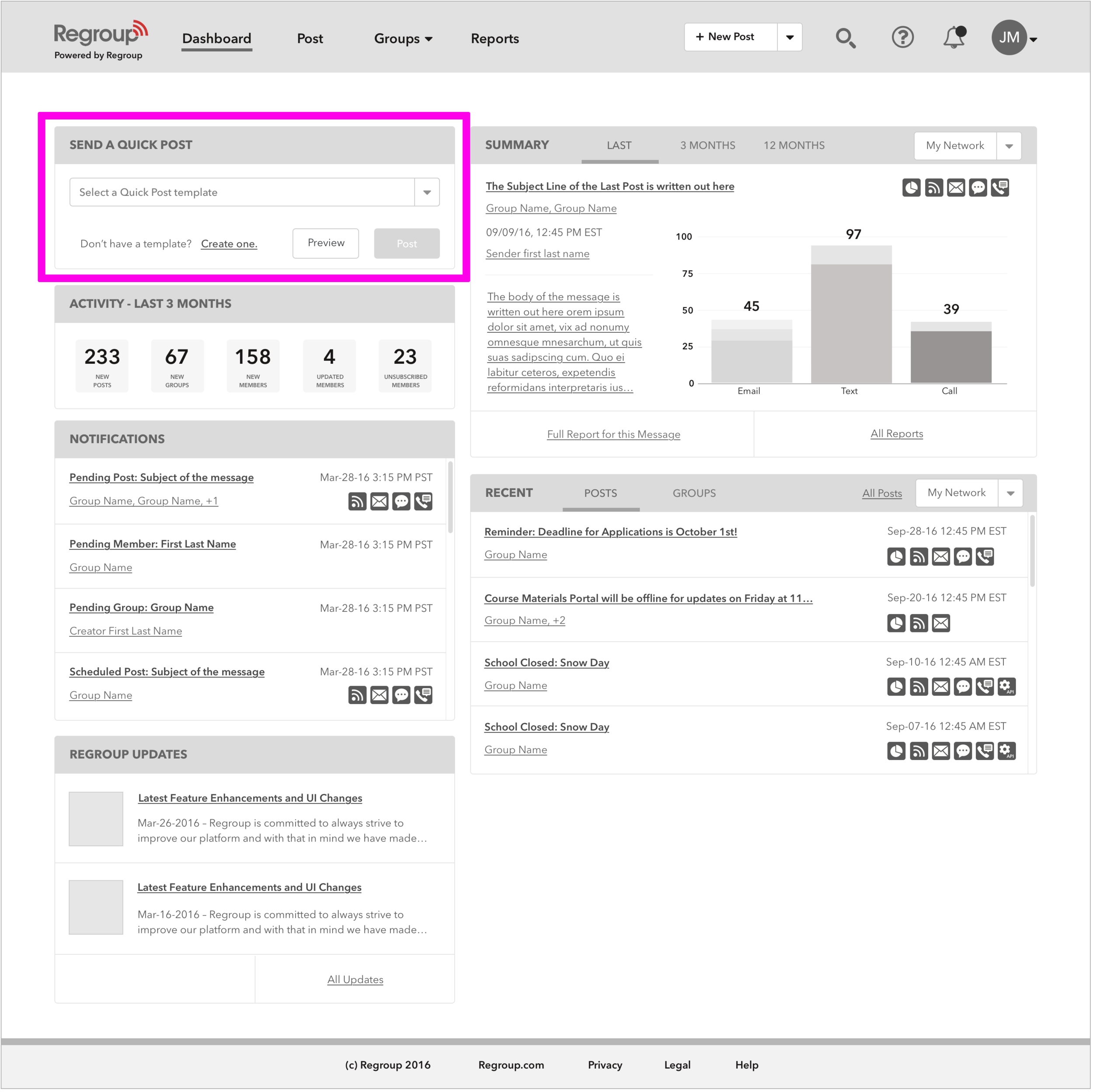
A large focus of the redesign was centered around the Dashboard. As the first page a user sees, it needs to provide relevant and useful information and offer the opportunity to dig deeper. Feedback from a survey of existing customers echoed the need to reassess the content and its value on the dashboard.

"The current dashboard is incredibly dated, and not organized. I would want to find jumping off points to all these things. Currently it is cluttered. It is a mess. Dependability; I like to know that my messages are reaching my targeted audience in a timely manner." – Current customer
Unlike the website, the regroup app uses templates as primary messaging medium
Regroup's primary function is a messaging service in the event of an emergency. Emergencies are stressful situations and the last thing an administrator wants to do is have to type out an articulate message. Templates and Quick Posts are a solution to prepare in advance of these emergency situations, reducing the workload on an already stressful situation.
The Regroup AlertManager iOS app utilizes the "Quick Post," a version of templates where all details (the groups to send to, the methods, and the content of the message) are pre-saved, allowing the message to be sent quickly and efficiently from an administrator's phone. Such an action was not easily available within the web application.
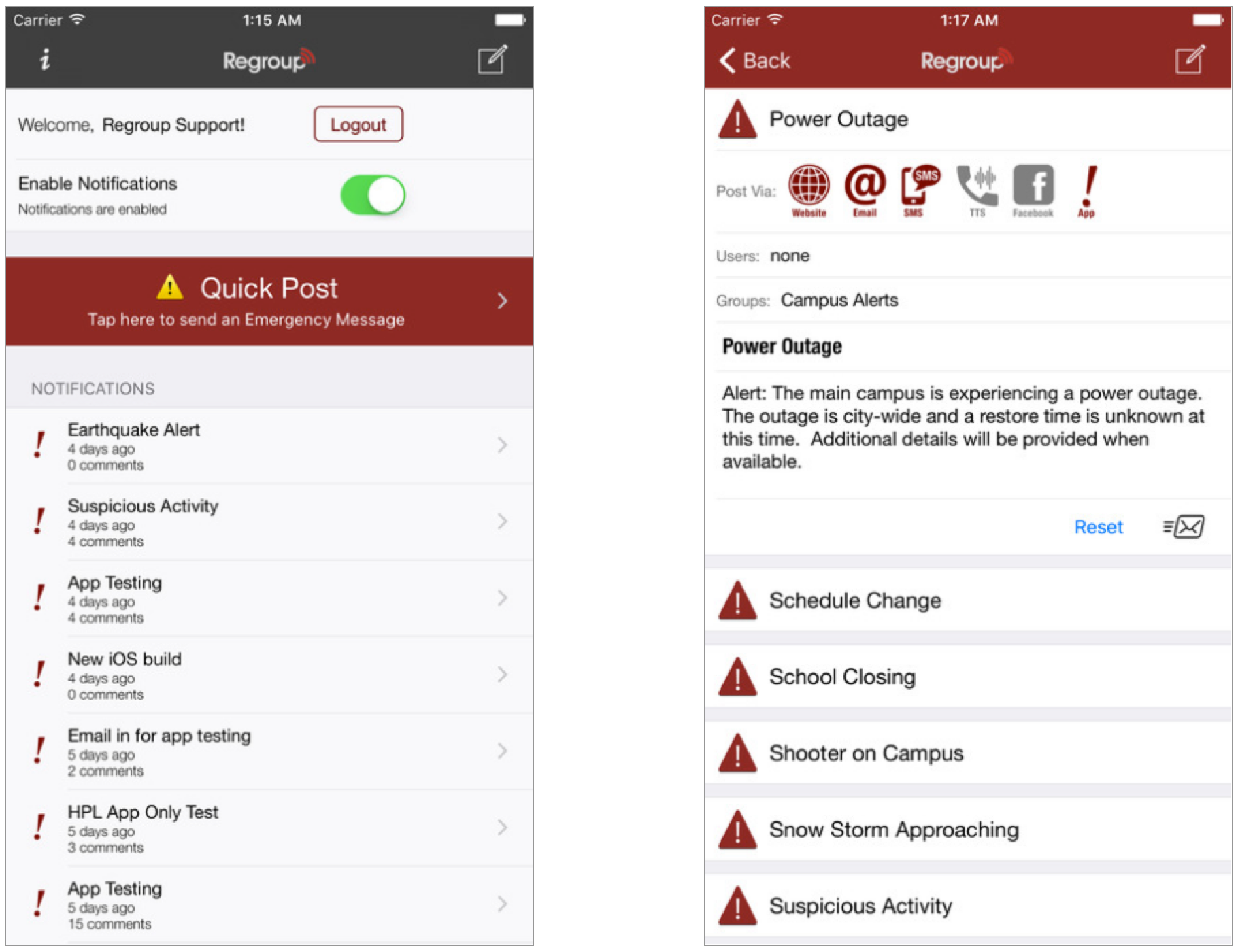
The Regroup AlertManager iOS app emphasizes Quick Post (template) messaging as the primary funcation.
Templates were not easily findable in the original web application
In the original interface, templates were buried behind several clicks that are not intuitive or easily findable. To create or edit a Template in the original application, users needed to go through the same flow as sending a message:
In the original application, the process for creating or editing a template wasn't intuitive or easily findable. The only location to access Templates was from the Post a Message page within the message selection options.
Templates are given priority on the dashboard redesign
Templates were included in the dashboard from the start, and a list of all templates could also now be accessed from the navigation (Post > Manage Posts).


A dashboard for quick actions, quick glances, & the ability to dig deeper
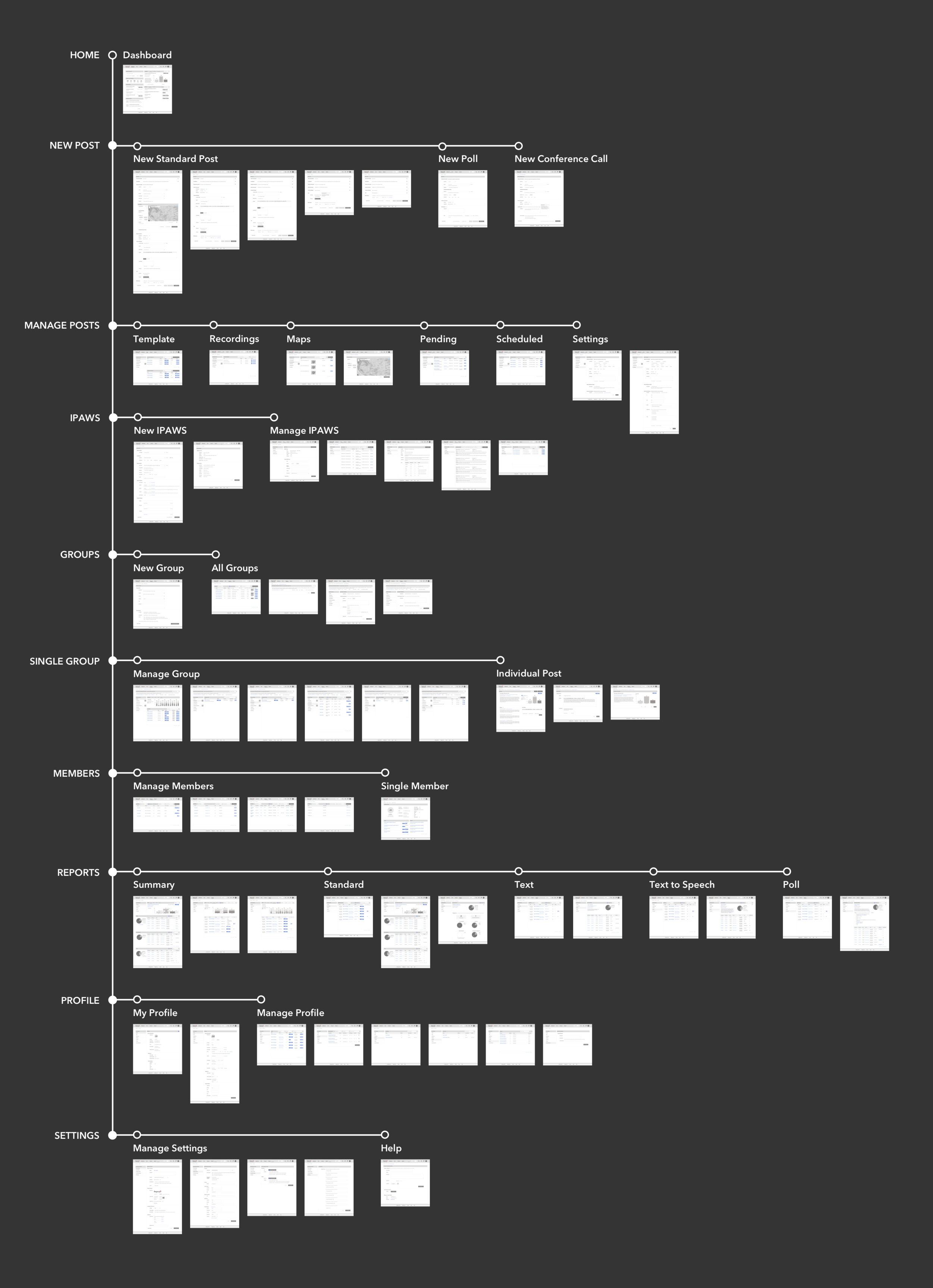
Map of the redesigned wireframes for the entire Regroup web app.
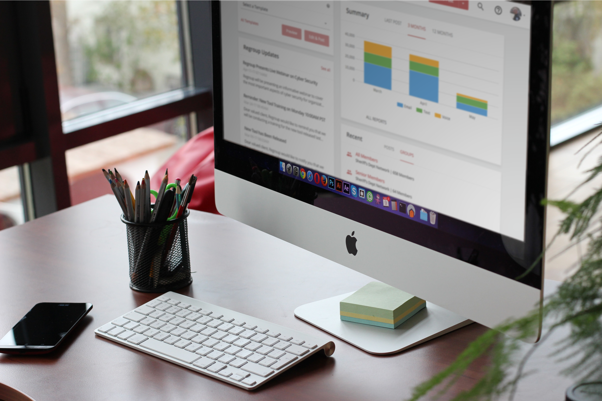
Application Redesign Shipped March 2017
Redesign for easy & efficient mass messaging
The original enterprise application was visually outdate and non-responsive with confusing navigation and some key functions were not easily findable. The redesign updated the application with a current and cohesive interface design to increase marketability, addressed information architecture to increase navigation usability, and surfaced key functionality (including templates).
Now that the product has been shipped (as of March 2017), next steps include gathering more metrics on customer usage and testing on redesigned usability now that's it's released.


Reflecting on Ambiguity as the Scope Changed
Moving forward also means reflecting back
From previous experience with clients, I made a concerted effort to keep the key stakeholders both informed and involved in the decision making. There were copious design reviews for feedback on functionality, technical feasibility, and consideration of the various customer use cases. But when other constraints changed (deadlines became tighter and scope of work grew larger), I didn’t revise my own scope to encompass these changes, and as a result, user testing of the new designs was done in a light-touch, high-level way. The next time constraints change, I'll also revise my own plan to ensure more in-depth usability testing with users is conducted to fully validate and address assumptions.