

ACCESSIBLE TOOLS FOR EFFECTIVE PRESENTATIONS
Addressing usability & error management issues for webinar presenters
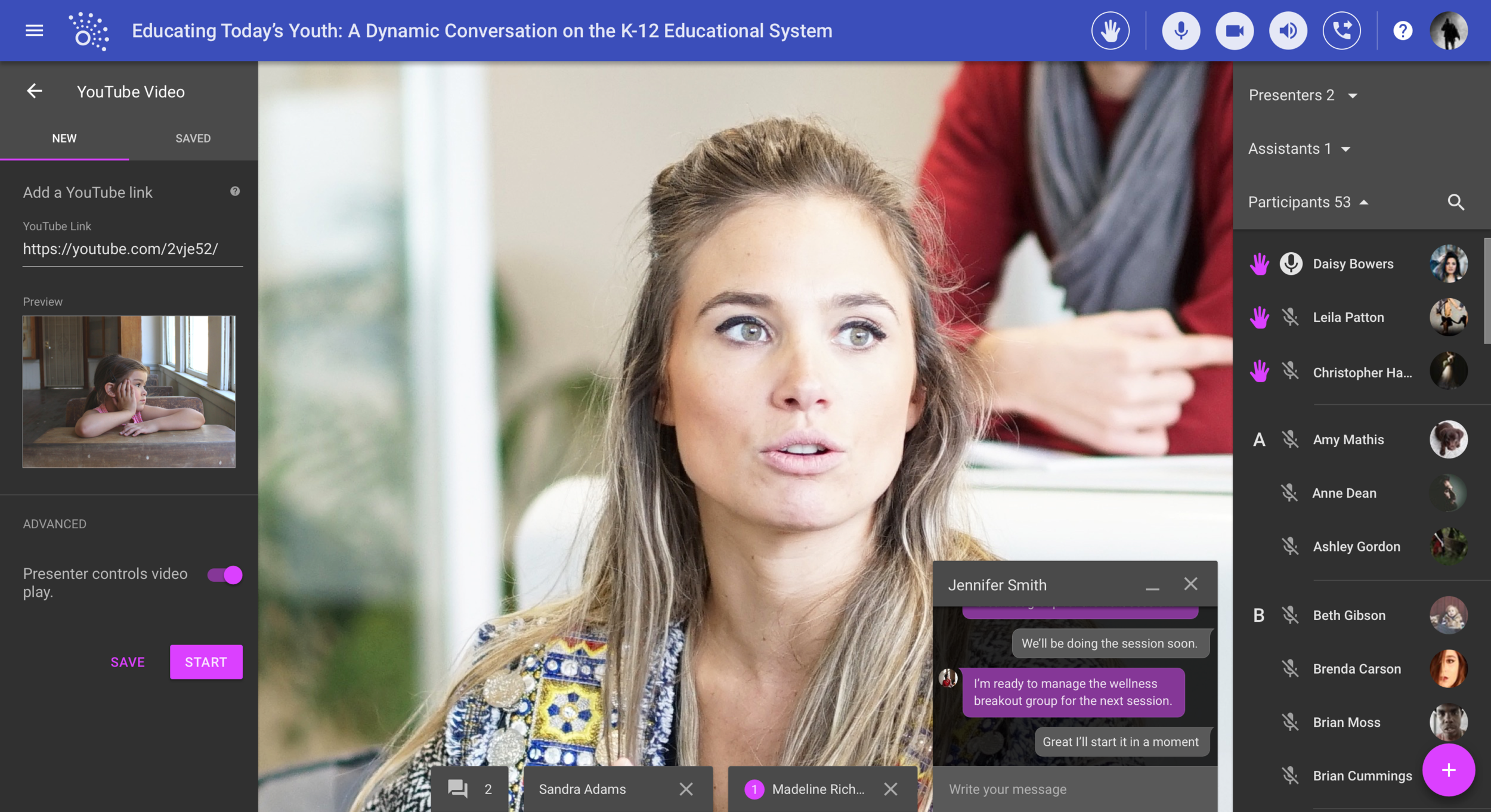
PRODUCT – MaestroConference brings online conferences to a new level with Social Webinar, an application that capitalizes on their patented breakout group technology to create an interactive space for richer conversations at scale.
CHALLENGE – While the original presenter controls (to change what the audience see) are robust, they are "difficult to use" and "clunky." Over the course of 2.5 weeks, our team was tasked to design a better solution.
REDESIGN – We redesigned the presenter's controls, bringing them to the forefront for quick and easy presentation preparation with fewer errors.
ROLE – I focused on user research and created a usability report of the original application for the client. Following the work with the client, I transformed the wireframes into high-fidelity mockups using the Material Design system. My UX design team included Ariana Lum and Ajay Soin.


Usability Testing the Original Design to Confirm our Assumptions
Evaluating the original application against best practices
As a team, we conducted an evaluation of the original application, breaking down the areas we found didn't meet the 10 heuristics for user interface design by Jakob Nielsen. While brainstorming and clarifying our thoughts on the problem at this stage was useful (and fun!), we hadn't yet spoken to users. I reminded myself that while I might have ideas, I am not designing for myself, after all.
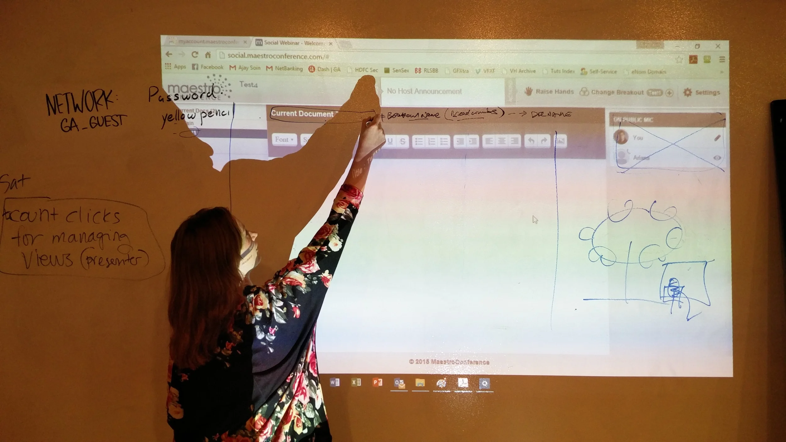
An unclear & confusing activation process
The presenters had to navigate unclear and not obvious steps to activate the various screens to share with the audience. In the original application, while trying to activate the screen share function, it was not clear to the user what is expected of them to properly complete the task. The process for activating each screen needs to have a consistent, obvious process to activate, that allows the user to easily learn and understand the process.
In the original application design, this is the control panel used by presenters to manage what is visually shared with the audience.

"I assume that when I click [copy url to clipboard], it should just open. I have used GoToMeeting and WebEx and it's one click. It's a very low barrier to entry." – Cathy, usability tester

"I don't know how I'm supposed to use this URL to start a [screen share] session." – Matthew, usability tester
User errors occurred from unhelpful feedback
Upon making a mistake, the presenters were not given clear direction on what error occurred or how to address it. In the original application, when screen share is activated, but not accurately set-up, the message that appears is confusing to users and does not clarify the problem or provide guidance to a possible solution. The steps to activate a view need to be clear and the fields need to be validated before the user can continue. In the event of an error, the messaging provided needs to be informative about what occurred and steps to remedy it.
In the original application design, the message displayed to the audience and presenter if screen share is not properly activated.

"Wait, I'm sharing my screen and I haven't started the meeting yet? I feel like an idiot." – Cathy, usability tester

"The meetings has not yet started? Maybe I need to restart the meeting somehow?" – Matthew, usability tester
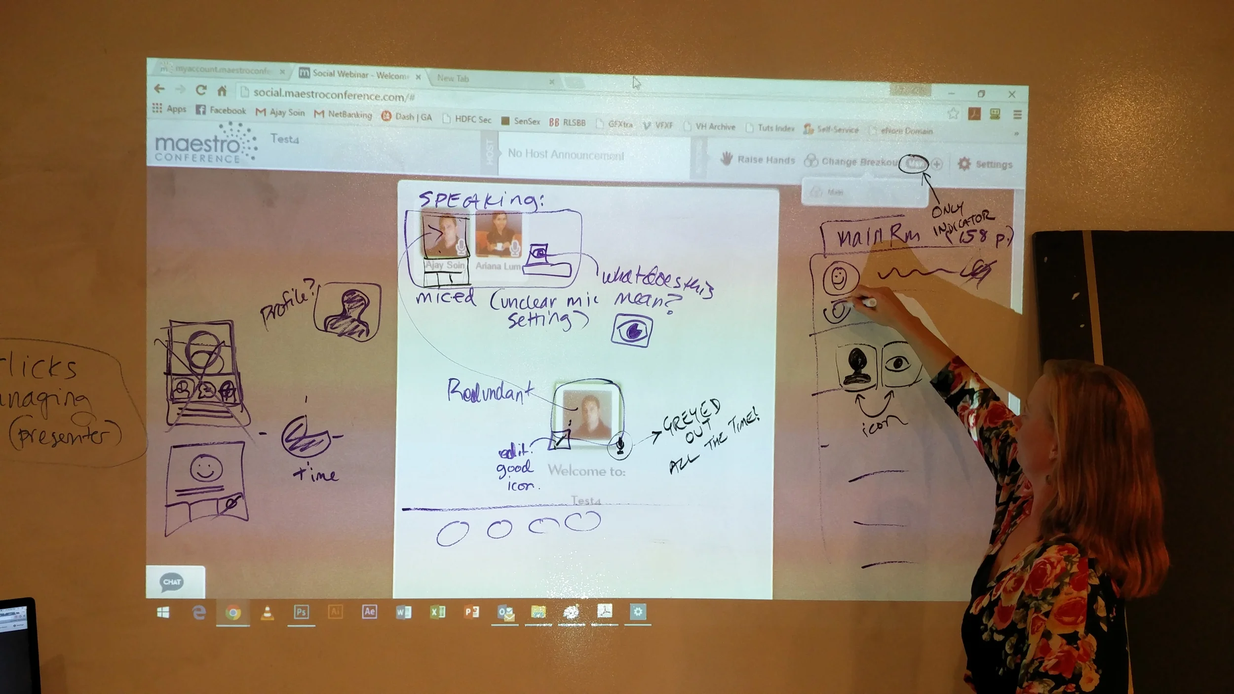
Confusing interactions & icons that are inconsistent with the real world metaphor
The hand-raising function was confusing, since it allowed a 1-5 voting option in addition to the more familiar raising of a hand to ask a question. In the original application, the presenter has to announce to the audience what number to use for different tasks, and at times participants are confused about what to do. The redesign should consider separate the functions of asking a questions and that of voting voting to reduce confusion.
In the original application design, the option hand-raising offered a 1–5 selection.

"It's confusing having multiple hands available. I thought I could select more than one. If they are primarily for voting, then they should only be visible when voting is available." – Matthew, usability tester

"Sometimes during a call, a participant will clear their hand selection, and a poll won't calculate correctly." – Barbara, current customer
Jumping into Design: Sketch-Test-Iterate-Repeat
Rapid generation of dozens of designs allowed us to filter & focus
Three heads are better than one. As a UX Team, we conducted a design studio to get our ideas down on paper and further the conversation. What started out as a list of tools accordion-style soon evolved into a toolbar across the top, similar to Microsoft Word or Excel's layout, a tool many people are familiar with. We decided that by keeping the tools visible would aid presenters in knowing what was available to them and how to initiate it. Clarifying the language used to describe the tools was also addressed.
The initial designs I sketched during the ideation process.
Design decision: show more controls & functionality to the presenter
Sketch of presenter's screen, drawn by Ariana Lum.
Quick access toolbar to the presenter's tools, grouped by type.
Clear and consistent activation steps when a tool is selected.
Attendee functions are more visible, previously hidden and unintuitive to find and presenter has more controls for mic/un-mic, previously on another screen.
Secondary participant activities area to increase engagement.
Primary content displayed prominently and provides the presenter with feedback on what audience is seeing.
Validated Design from User Feedback
Rapid paper prototype testing validates & provides insights for iteration
To better tell the story for usability testing, in addition to presenter screens that they tested, we created a corresponding set of participant screens. I conducted usability tests with six new volunteers and insights included:
Use layman's terms for the directions in the left inspector section, as some verbiage was still too technical and confusing to users.
Provide visual cues or other confirmation to presenter that they are correctly activating the tools, such as error messaging when a field is empty or incorrectly entered.
Provide easy to understand settings and customization options to meet different presenter needs.
Reduce participant confusion about voting and asking a question (hand raising).
The presenter has control throughout the process
Presenter's screen while Play YouTube Video tool is active - wireframe by Ariana Lum.
Presenter Activity: Playing a Video
Help text located right where it is needed (instead of a list at the bottom).
Preview windows to provide presenter with a visual confirmation that they have included the correct web address.
Technical language replaced with easier to understand language to avoid confusion and errors.
Designing for effective presentation preparation
Many existing customers I interviewed mentioned that in preparation for a presentation, the presenter would draft a full script with all the activities and information to execute it. In the redesign mockup I created, I included the option to save, which would allow presenters to prepare within the application instead of relying on an external document.

"Presenters know what they want to present and when, even down to the minute. It's all planned out in advance." – Barbara, current customer
The iterated mockup I created for the YouTube video controls, introducing the option to save, to allow presenters to prepare for a presentation activities in advance.
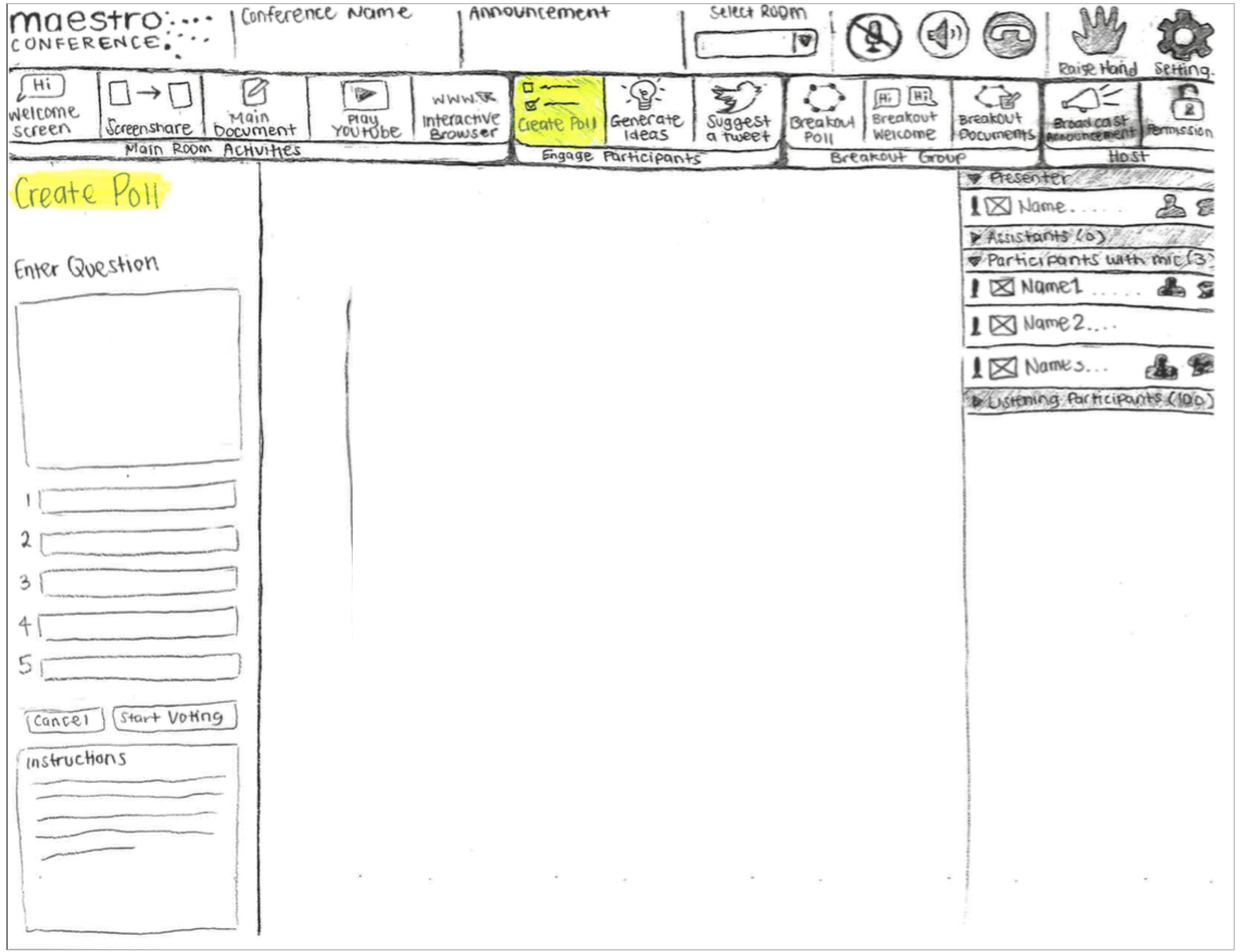
Adding customization to increase participant engagement
Presenter's screen while Create a Poll tool is active. Wireframes by Ariana Lum.
Presenter Activity: Conducting a Poll
Allow presenter to including written questions and answers for participants to respond to.
For select engagement activities, presenter can control location of content (secondary content area).
Mockup of polling setup screen for presenters.
Separated participant tasks to reduce confusion & errors
Participant's screen while a Poll is active in the lower right section. Wireframes by Ariana Lum.
Participant Activity: Responding to a Poll
Participants can read question and answer on screen, instead of only hearing the question and answer options
Reduce participant errors and distinguish voting with questions by answering questions occur right in the polling space (rather than using the raise hand 1-5 options).
Storyboarding the users' Story
Visually communicating the users' story with stakeholders
The redesign for polling eliminates the confusion with the hand-raising function, which our first-time users expressed during usability testing. I created a storyboard to show how participants can participate in the poll activity. Participants on a computer (with audio and visuals) can see the question and answer options, submit their vote, and see the results. Participants on the phone (with audio only) can vote in the poll activity, though will only hear the question, answer options, and results.
To show the redesign's usefulness during polling, I created this storyboard.
Redesigning the Presenter Tools to Reduce Errors
Accessible & understandable presentation experience with tools on hand
For presenters, the original application had a hidden set of tools several clicks away, unclear activation processes, frustratingly unhelpful error messages. The redesigned application had understandable and findable presenter tools, the ability to save in advance, and fewer user errors. Next steps for the application includes usability the testing mockup and to collect and analyze data on frequency presenters use each tool to prioritize the features further.


Reflecting on User Research
More data needed on frequently used tools
Feedback on the prototype included the toolbar being overwhelming upon first glance. To ensure the primary function of the product is not watered-down by too many features, more data on what tools are used and their frequently is needed. While we had gathered some qualitative data on feature use during the customer and staff interviews, it wasn't the main focus of our conversations. For a next iteration, I would test and validate a redesign that takes into consideration the most popular tools as priority, in order to address the user's sense of feeling overwhelmed.